Introduction
「表单」和「表格」是工作流中最常使用的组件,在官方文档中的介绍非常多,很详细地介绍了每个功能和每个字段。现在记录一下 form 表单基本的用法。
1
2
3
4
5
6
7
8
9
10
11
12
13
14
15
16
17
18
19
20
21
22
23
24
25
26
27
28
29
30
31
32
33
34
35
36
37
38
39
40
41
42
import React from "react";
import { Button, Form, Input } from "antd";
const onFinish = (values) => {
  console.log("Success:", values);
};
const Todo = () => {
  return (
    <div>
      <Form
        name="basic"
        labelCol=
        wrapperCol=
        style=
        onFinish={onFinish}
        autoComplete="off"
      >
        <Form.Item
          label="Username"
          name="username"
          rules={[{ required: true, message: "Please input your username!" }]}
        >
          <Input />
        </Form.Item>

        <Form.Item
          label="Password"
          name="password"
          rules={[{ required: true, message: "Please input your password!" }]}
        >
          <Input.Password />
        </Form.Item>

        <Form.Item wrapperCol=>
          <Button type="primary" htmlType="submit">
            Submit
          </Button>
        </Form.Item>
      </Form>
    </div>
  );
};
export default Todo;
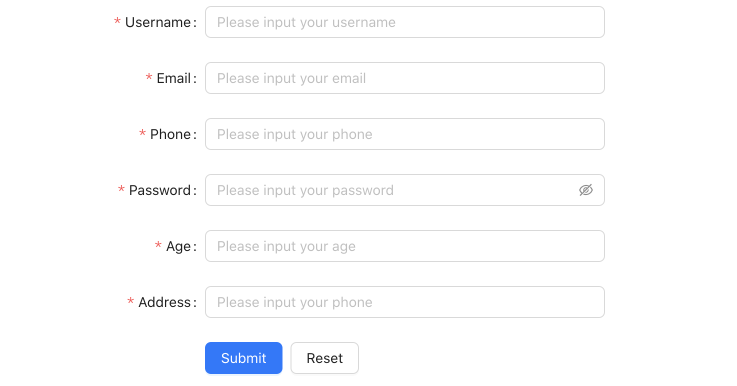
基本上,结构和 element ui的相似,都是一个 form ,里面是每一项。来说明几个基础的属性。
栅格布局,antd 把容器分成了 24 份。
「labelCol」: 每一项 label 的占位,这里没有像 el-form 一样有 auto 属性,可以自定撑开宽度。可以根据实际设置为多少格。
「wrapperCol」: 即内容区域的配置,最基础的属性则为 span ,一般与「labelCol」加起来是 24。
「onFinish」: 表单校验通过后的后调,一般在此处发起接口请求。
Content
表单能展示并且能在 onFinish 中拿到数据了,但不应仅限于此,表单最核心的是交互。现在看看在表单中是如何进行简单交互的。
上面的基础使用没有对参数进行类型标注,下面从业务开发的角度,补全「类型标注」、「数据验证」和「表单赋值」等基础功能。
Type Annotation
引入 form 的类型声明文件
1
import type { FormProps } from "antd";
对表单字段进行类型标注
1
2
3
4
5
6
7
8
type FieldType = {
  username: string;
  email: string;
  password: number;
  age: number;
  address: string;
  phone: string;
};
对事件,如验证成功的回调函数进行类型标注
1
2
3
const onFinish: FormProps<FieldType>["onFinish"] = (values) => {
  console.log("Success:", values);
};
在组件上的表现,如
1
2
3
4
5
6
7
<Form.Item<FieldType>
  label="Username"
  name="username"
  rules={[{ required: true, message: "Please input your username!" }]}
>
  <Input placeholder="Please input your username" />
</Form.Item>
Component structure and style
在组件中,有的「受控组件」的宽度是随父元素,有的是固定值,因此我们要稍微调整。调整下 InputNumber 的宽度,让它和其他组件保持一致。
很幸运能选到,如果改不了,可以用深度选择器
1
2
3
4
5
6
7
8
9
.ant-form {
  .ant-form-item {
    .ant-form-item-control-input {
      .ant-input-number {
        width: 100%;
      }
    }
  }
}
特别说明几个组件的用法:
-
InputNumber: 数字输入框,可以限制输入范围,比如只能输入整数。
1
2
3
4
5
6
7
<Form.Item<FieldType>
  label="Age"
  name="age"
  rules={[{ required: true, message: "Please input your age!" }]}
>
  <InputNumber placeholder="Please input your age" />
</Form.Item>
-
Input.Password: 密码输入框,会有小眼睛的图标。
1
2
3
4
5
6
7
<Form.Item<FieldType>
  label="Password"
  name="password"
  rules={[{ required: true, message: "Please input your password!" }]}
>
  <Input.Password placeholder="Please input your password" />
</Form.Item>
-
Button: 按钮,嵌入到 Form.Item 中,设置
htmlType="submit"的属性,可以让按钮提交表单。1 2 3 4 5
<Form.Item wrapperCol=> <Button type="primary" htmlType="submit"> Submit </Button> </Form.Item>
对一些组件进行配置,如果默认选项等。
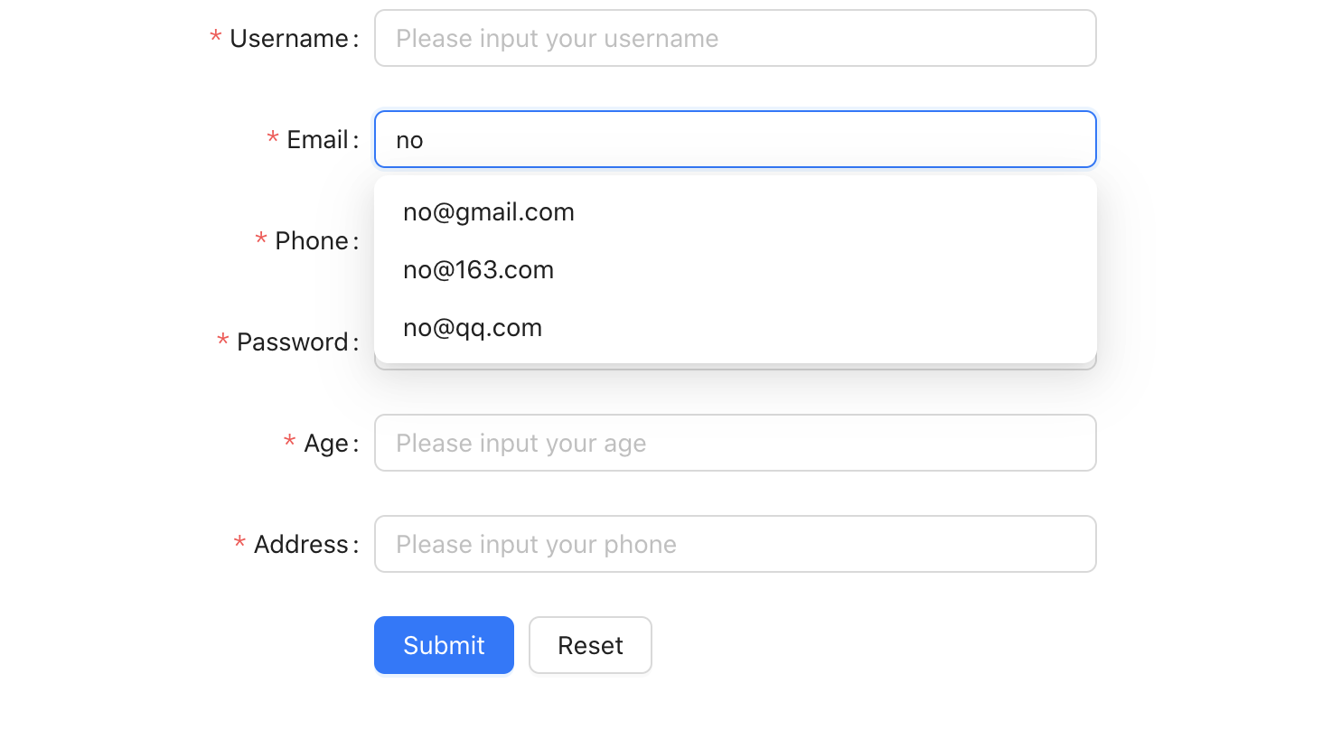
- AutoComplete: 自动完成,可以设置提示信息。
如邮箱,我们可以设置
addonAfter为一个Select组件,选择邮箱服务商。但是,还是不太方便,我们可以使用「提示」的方式,来选择邮箱服务商。1 2 3 4 5 6 7 8 9 10 11 12 13 14 15 16 17 18 19 20 21 22 23 24
const [options, setOptions] = useState<AutoCompleteProps["options"]>([]); const handleSearch = (value: string) => { setOptions(() => { if (!value || value.includes("@")) { return []; } return ["gmail.com", "163.com", "qq.com"].map((domain) => ({ label: `${value}@${domain}`, value: `${value}@${domain}`, })); }); }; // 其他内容... <Form.Item<FieldType> label="Email" name="email" rules={[{ required: true, message: "Please input your email!" }]} > <AutoComplete onSearch={handleSearch} placeholder="Please input your email" options={options} /> </Form.Item>;
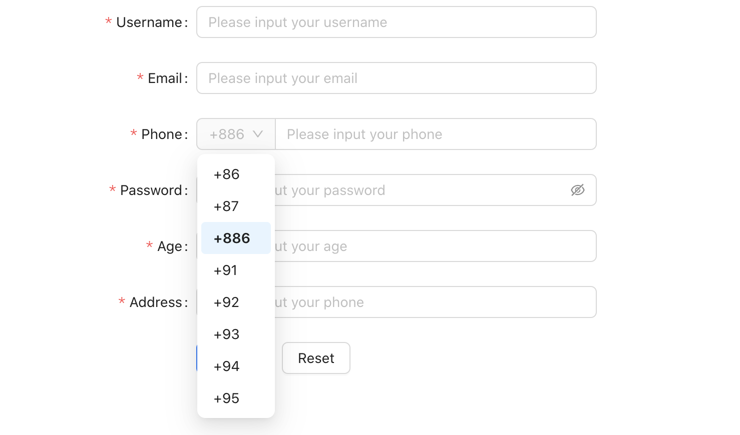
-
addonBefore: 前置标签,可以设置一些提示信息或选项。 如手机号码,我们可以设置
addonBefore为一个Select组件,选择国家代码。1 2 3 4 5 6 7 8 9 10 11 12 13 14 15 16 17 18
// 手机号前缀 const selectBefore = ( <Select defaultValue="+86"> {phonePrefix.map((item) => ( <Option value={item.value} key={item.value}> {item.label} </Option> ))} </Select> ); // 其他内容... <Form.Item<FieldType> label="Phone" name="phone" rules={[{ required: true, message: "Please input your phone!" }]} > <Input addonBefore={selectBefore} placeholder="Please input your phone" /> </Form.Item>;
Data format verification
表单的验证是表单的核心功能之一,我们需要对输入的数据进行验证,以确保数据的准确性。
一般验证,我们会使用 rules 属性,它是一个数组,数组的每一项是一个对象,对象中有 required、message、type 等属性。rules 文档
-
一般静态校验,
1
2
3
4
5
6
7
<Form.Item<FieldType>
  label="Username"
  name="username"
  rules={[{ required: true, message: "Please input your username!" }]}
>
  <Input placeholder="Please input your username" />
</Form.Item>
-
邮箱校验格式校验,邮箱格式只能来源于「规定的」。
1
2
3
4
5
6
7
8
9
10
11
12
13
14
15
16
17
18
19
20
21
22
23
24
<Form.Item<FieldType>
  label="Email"
  name="email"
  rules={[
    { required: true, message: "Please input your email!" },
    () => ({
      validator(_, value) {
        const isValidEmail = (value: string) => {
          return emailType.some((suffix) => value.includes(`@${suffix}`));
        };
        if (value && !isValidEmail(value)) {
          return Promise.reject(new Error("未正确填写邮箱,请重新输入!"));
        }
        return Promise.resolve();
      },
    }),
  ]}
>
  <AutoComplete
    onSearch={handleSearch}
    placeholder="Please input your email"
    options={options}
  />
</Form.Item>
-
对年龄进行粗略的校验,只能输入整数
1
2
3
4
5
6
7
8
9
10
11
12
13
14
15
16
17
18
19
20
21
22
23
const parser = (value) => {
  // 移除非数字字符
  return value.replace(/\D/g, "");
};
// 其他内容...
<Form.Item<FieldType>
  label="Age"
  name="age"
  rules={[
    {
      required: true,
      message: "Please input your age!",
    },
  ]}
>
  <InputNumber
    placeholder="Please input your age"
    min={1}
    step={1}
    parser={parser}
    formatter={(value) => value}
  />
</Form.Item>;
Form Interaction
表单的交互,主要是对表单项进行基础的赋值和修改等。使用 useForm 来获取表单实例,然后通过 getFieldValue 和 setFieldsValue 来进行表单项的赋值和修改。
-
清空表单数据,
1
2
3
4
const [form] = Form.useForm<FieldType>(); //可以进行类型标注,方便使用
const onReset = () => {
  form.resetFields();
};
- 表单赋值,
例如表单的编辑,就需要我们页面初始化的时候给表单进行赋值操作。而对于类型标注,应该是有一个
interface,在异步请求的时候,进行标注。在拿到数据后,给表单赋值时,也应该进行类型标注,保证数据类型一致。1 2 3 4 5 6
useEffect(() => { userForm().then((res) => { const { data }: { data: FieldType } = res; form.setFieldsValue(data); }); }, [form]);
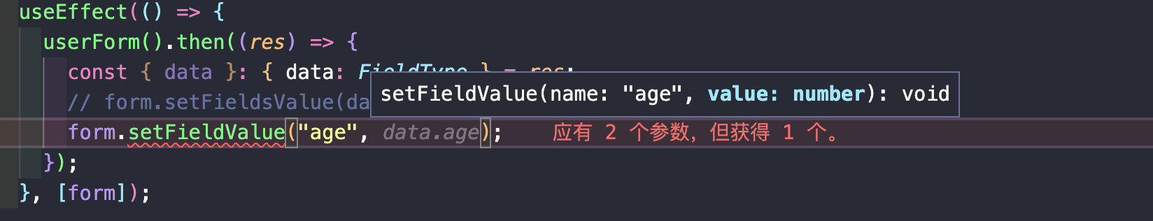
-
注意点, 在使用
setFieldValue对单个表单项进行赋值时,我发现并不会出现类型提示。如对age进行赋值,按理说 value 应该是number类型,但是实际上,setFieldValue并不会对类型进行校验。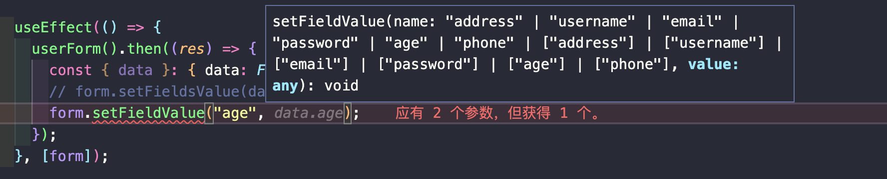
因此,找到
setFieldValue的定义,「value」的类型是any。1
setFieldValue: (name: NamePath<Values>, value: any) => void;
使用泛型推断,使「value」的类型来源于 「name」
1
setFieldValue: <K extends keyof Values>(name: K, value: Values[K]) => void;
 使用这种方式,就可以对
 age进行类型标注,并保证数据类型一致。Summarize
到此,表单的基本使用就介绍完了,基本上,表单的功能都可以用上面的代码来实现。而其他的拓展功能,如表单项的类型,涉及到「input」的拓展类型。还有调用接口进行异步校验、动态添加表单项、表单项之间的关联校验等等,这些都需要根据具体的业务场景进行设计和实现。其使用方法详见官方文档。